Abigail Rocha. Chica Artista.
My venture into the world of Illustration.
Wednesday, October 9, 2019
Monday, April 15, 2013
Body in Motion
Ink is one of my favorite mediums. The very thing that makes it intimidating is appealing to me. It's unforgiving and immediate and forces me to draw with confidence. This can either go terribly wrong or wonderfully right. Body In Motion is a class i'm taking this semester where we only do poses up to 10 minutes (usually we stick around the 3-5 minutes range) of live models in ink and wash with brush and pen. The result is immediate, expressive renderings of people. The following I was pretty happy with.


Wednesday, April 10, 2013
Promo Assignment.
I'm been a fan of Robert Kirkman's walking dead comic for a long time, and like a lot of tv watchers out there, also of the series on AMC. But my heart will always belong to the comic. Mainly because it's more about the human condition dealing with the zombie apocalypse instead of it being about the zombies and the gore which can be appealing but not as rich of a topic. Which the AMC tv series is doing as pretty well. Especially in the last season's episode, "Clear". Wow.
One of the characters that has fascinated me for a long time is Michonne, the mysterious outcast and badass mistress with a sword.
So here comes along an assignment in class where we are to do a portait of a fictional/non-fictional character and I couldn't pass it up.
Here is Michonne rendered with love. Hope I did it justice.
Oil, with acrylic underpainting. 14"x20"
Monday, February 25, 2013
One more thing.....
Just to wrap up last semester (for reals this time), my self portraits from Illustration 1, as an inspirational collected works poster. As well as something new from this semester of Illustration 3.

Might have been looking at victorian era illustrations while i was working on these two.
Illustrating the idiom, "Bending over Backwards". Aaaaw so cute! I think i just barfed a little. ;-D
Illustrating for an advice article where a gal is fed up with her "speedy" man in bed.
Go rocket man GO!

Illustrating the idiom, "Bending over Backwards". Aaaaw so cute! I think i just barfed a little. ;-D
Illustrating for an advice article where a gal is fed up with her "speedy" man in bed.
Go rocket man GO!
Anyways. I'm off! Hope to post up more soon.
-Abby
Wednesday, February 13, 2013
Catching up on posting things from last semester.
So life has been GO GO GO! In a fun and interesting way.
I had winter break so we went to S.L.O/San Diego to visit the family (yay!)and promptly got very sick upon our arrival home (boo!). However instead of bed rest, my boss needed me to work 40 hours(damn you people getting fired!) so I worked in the freezing cold docks of Fisherman's wharf which resulted in not getting any better and 3 weeks later, BAMN! oh hello again school! So here I am, 3 weeks in with shiny new work to post up but realizing i haven't finished posting up everything from last semester. Here is my attempt.
Illustration 1:
Let's start with a funny. The infamous Black Sabbath poster assignment. There are some that just refer to me as simply "Sabbath". Made the band members into a skull shape. Ink and brush. Killer right? Except for one thing....
Here's a lesson to you kids, when putting naked men into a made up arrangement, be careful about where you place pelvic areas in regards to fists....because otherwise it might look like porn. Never been so embarrassed in my life, I still turn red thinking about it. And to do this to my idols. FML. XD
Magic the Gathering Card Assignment:
Some green forest trampling snake with 6/6 power. Love MTG, but I could of done better. Acrylic.
CCA T-shirt Illustration.
This was fun I almost won a t-shirt done of the image. But something infinitely cuter won. Oh well. So it's fish eating each other, with mouths or shapes suggesting the "CCA" letters. In case you were curious, yes the illustrated fish was eating the fine art fish who in turn was eating the architect pro-tractor fish. LOL.
Imaginary place travel poster.
I chose hell. Specifically, Dante's inferno's hell. Because the giants look like mountains. And I hear it's always warm there. ;D
Illustration 2:
Editorial assignment about Obama and Romney. Horray political cartoons! I've included the rough sketchs and my ideas. This was actually really fun and simple.
Charity Poster Assignment. This assignment was for Edible Schoolyard, a non profit, worldwide educational organization about bringing sustainable gardens and such, to kids all over who might otherwise not have access. It was a cause I wholeheartedly believe in and is near to my heart. It was started here in Berkeley partly by Alice Waters, of Chez Panisse fame. I liked all the research involved, immersing one self in new knowledge is such a huge part of being an illustrator. To date this is the most colorful thing I've done. Gouache is fun!
Gilliam film festival poster.
Very excited about the assignment but not so hot about the outcome. I really want to rework it. Tara, a fellow student in class suggested adding red theatre curtains. An idea I really like. So disappointing when things don't turn out the way you envision. Ugh.
Here's a close up of my favorite bit though:
Anyway, it's time to go to History of Illustration class. Thanks for looking! Catch ya all later.
Besos!
-Abby
Thursday, December 6, 2012
THE END IS IN SIGHT....for this semester, yay!
So my next post should be putting up work from this (prolific compared to others) semester and perhaps a quick (or long) reflection about it. I am going on holiday(as the brits say), to SLO and S.D. to see family/friends so after that ya'll see lots more stuff. So if this is the last post till the next year (unless the apocalypse happens), enjoy you're special time with the people/pets/beer you love most.
-ChicaArtista
This work by Abigail P Rocha is licensed under a Creative Commons Attribution-NonCommercial-NoDerivs 3.0 Unported License.
Tuesday, October 30, 2012
The Illustrative Process...not entirely annoying!
So I thought i might try something different with today's post. Instead of just showing you the finished product, i thought i might show you the process I go through. Just in case, like myself when I first started, you were clueless on how illustrators approach a piece. They really problem-solve!
My usual practice when approaching a piece is just go at it with a medium of my choice and not really brainstorm/sketch too much...with mixed results. Ever since I've switched to the illustration major, I've had to slow down my process and re-do sketches like, a million times before it's "done", and i admit, with better, more cohesive results. It was frustrating at first because i'm naturally impulsive and a tad impatient, but now I can see how it can be really useful.
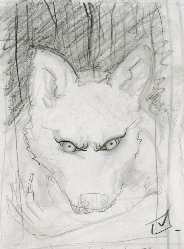
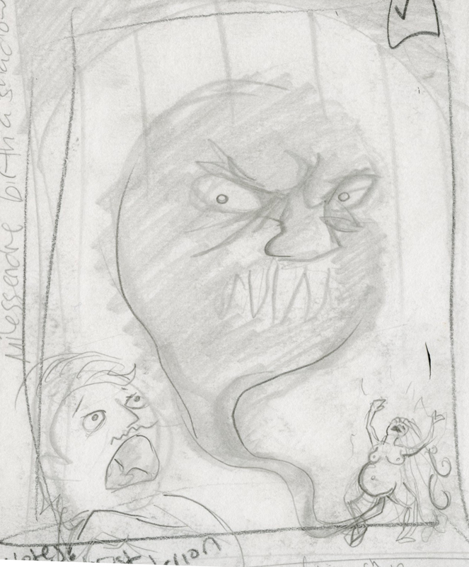
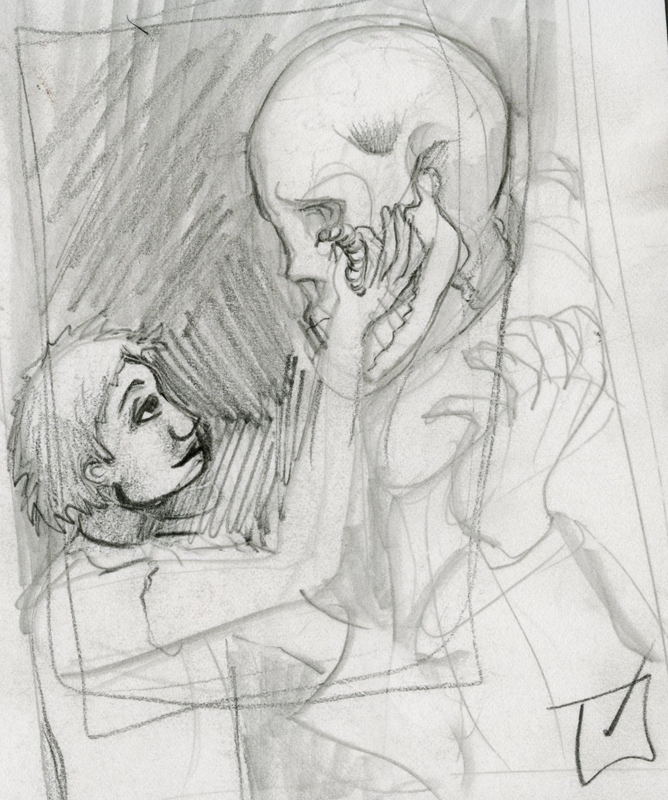
So here's how it goes, our professors act as Art Directors and give us an assignment/job and we bam out thumbnails. This assignment was for an in-book illustration in graphite: I chose Game of Thrones because I'm a huge fan. We sketched 12 thumbs (about 4"x5.5") in all but here are some ideas that actually made the cut:
 |
| Ghost with a zombie arm. |
 |
| Melissindre giving birth to a shade. I think the faces are so funny in this one. |
 |
| Arya plucking a grave worm from a skull in the house of black and white. |
We are given feedback (proportion, contrast, crop, composition, references, etc.) and we do final sketches of the 3 and from there the instructor (or in real life, the art director) chooses one image, makes further suggestions for changes and gives us he green light to do the final artwork. These are the 3 final sketches(about 5.5"x8") I provided to pick from....
 | |||
| This is the one my profe green-lighted with still more corrections to do... |
So after all that push and pull, drawing and re-drawing I did the final piece....
So yeah, this is how i'm working now a days. It's better to have a plan and revisit ideas than to risk doing one of these....
Stay classy my friends. <3
Subscribe to:
Comments (Atom)


